A yard sign has one job: deliver its message to someone who is walking or driving past, in the second or two before they look away. Most signs that fail do not fail on print quality or material. They fail on design, because they were laid out on a computer screen from two feet away and then staked at the curb where they are read from forty feet away at an angle. The good news is that legibility follows a few measurable rules, and once you know them you can design a sign that actually gets read.
Size your text for the distance it is read from
The single most useful number in signage is the relationship between letter height and reading distance. The working rule across the sign trade is that every inch of capital-letter height buys roughly ten feet of comfortable reading distance, and the absolute maximum at which text stays legible stretches several times further. A 3-inch headline reads comfortably at about 30 feet and remains legible out to roughly 100 feet; a 4-inch headline is comfortable near 40 feet and legible to about 150. The chart below shows how that scales.
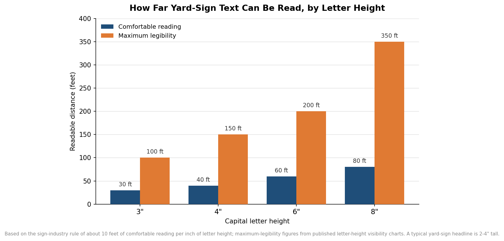
For a typical lawn sign, the headline is usually the biggest thing that will physically fit, which lands most main lines in the 2-to-4-inch range on an 18-by-24-inch sign. That is fine for a reader on the sidewalk or a slow residential street. The mistake is applying the same size to everything: a phone number or a website set in the same modest type as body copy simply will not resolve from the curb. If a detail matters, it has to be large, and if it cannot be large, it probably does not belong on the sign at all.
Respect how little time a passer-by gives you
Reading distance is only half the story, because the reader is often moving. A person on foot has a few seconds; a driver has far less. With a clear hundred-foot line of sight, a car at 20 miles per hour gives the reader about three and a half seconds, and at 40 it is under two. The chart below makes the squeeze visible.
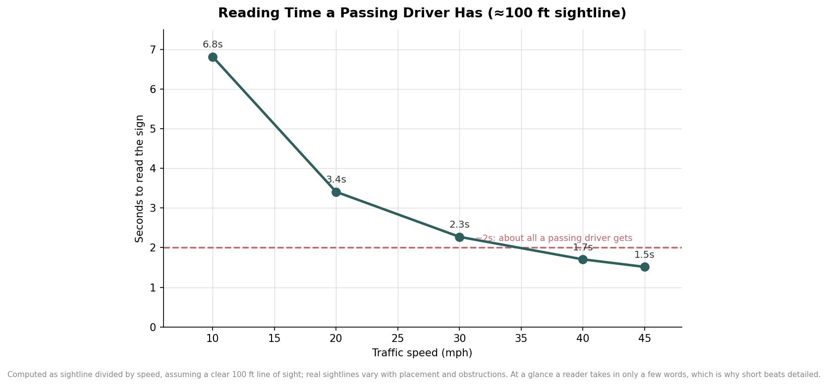
At a glance a reader takes in only a handful of words, which is why the strongest yard signs carry one idea, not a paragraph. A useful discipline is to decide the single thing the sign must communicate, make that the headline, and let everything else be secondary or cut. Campaign signs that just say a name, directional signs that say one arrow and one place, and open-house signs that say the time and a bold arrow all work because they respect the two-second budget. A sign that tries to list every service and a mission statement communicates nothing, because the reader is gone before the second line.
Contrast and font do the quiet work
After size and word count, legibility comes down to contrast. Dark text on a light field or light text on a dark field reads from much farther away than any low-contrast pairing, no matter how fashionable the colors look on screen. Combinations like black on yellow, white on a deep blue or red, and black on white are legible standards for a reason. The pairings that betray a sign are the tasteful, low-contrast ones: gray on white, navy on black, or a colored text over a busy photo where the letters and the background compete.
Typeface matters almost as much. A clean, heavy sans-serif with generous letter spacing holds up at distance, where thin, condensed, or decorative scripts smear into an unreadable blur. Avoid setting words in all capitals for anything longer than a short headline, because mixed case gives the eye word shapes to latch onto and reads faster. Give the letters room to breathe with real spacing between lines and a margin around the whole layout, since text jammed to the edges is both harder to read and more likely to be lost when the sign is trimmed or mounted in a frame.
Design for where the sign will actually stand
The last mistake is designing without thinking about placement. A sign viewed from one side only can put all its weight on a single face, but a sign at a corner or in a median is read from several angles, which argues for a double-sided print and a simple, centered layout that works from either approach. Signs low to the ground get partly hidden by grass, parked cars, and foot traffic, so the message should live in the upper two-thirds where it stays visible. Glare and evening light wash out subtle colors, another reason to favor high contrast and bold shapes over fine detail.
None of this requires design software or a big budget. Pick the one message that has to land, set it in a bold high-contrast headline sized for the distance it will be read from, keep the supporting text to the few words a passer-by can actually absorb, and lay it out cleanly with margins and a second face if the sign will be seen from more than one side. Do that, and the sign earns its place at the curb instead of becoming visual noise. When you are ready to produce it, a quick proof viewed from across the room, not up close, is the cheapest way to catch a layout that will disappear at the distance it really has to work.